Leading Data Visualization Company in Texas: Transforming Complex Data
Data visualization is the graphical representation of data to help people understand complex information. At Laterial Matrix, we assist in data visualization by utilizing advanced tools and techniques to create visually appealing and interactive visualizations. Our team of experts ensures that data is presented in a clear and concise manner, enabling businesses to make informed decisions based on the insights gained from the visualizations.

Why Business Needs Data Visualization Services
Are you a business owner in Texas looking to take your company to the next level? If so, then you need to consider the importance of data visualization services for your business. In today's fast-paced and data-driven world, having the ability to effectively analyze and present your data is crucial for making informed decisions. Data visualization services can provide you with the tools and expertise needed to transform your raw data into meaningful and visually appealing charts, graphs, and dashboards. By visually representing your data, you can easily identify patterns, trends, and insights that may have otherwise gone unnoticed. This can help you make more accurate predictions, identify areas for improvement, and ultimately drive your business forward. Furthermore, data visualization services can also help you communicate your findings to stakeholders, clients, and employees in a clear and concise manner. Visual representations of data are often easier to understand and digest, making it easier for others to grasp the significance of your findings. In conclusion, if you want to stay ahead of the competition and make data-driven decisions, investing in data visualization services for your business in Texas is a must. Don't let valuable insights go to waste – harness the power of data visualization and unlock the full potential of your business.
Our Data Visualization Services
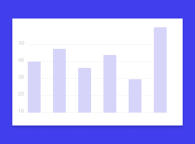
Bar Charts
Bar charts are a common type of data visualization service that allows you to compare different categories or groups by using rectangular bars of varying lengths. This visual representation makes it easy to understand and interpret data quickly.
Line Graphs
Line graphs are useful for showing trends and patterns over time. By plotting data points on a graph and connecting them with lines, you can visualize how variables change and identify any correlations or relationships.
Pie Charts
Pie charts are ideal for displaying proportions and percentages. They use a circular shape divided into slices, with each slice representing a different category or group. This type of visualization helps you understand the distribution of data in a visually appealing way.
Scatter Plots
Scatter plots are effective for visualizing the relationship between two variables. By plotting data points on a graph with one variable on the x-axis and the other on the y-axis, you can identify any patterns or trends that may exist.
Heat Maps
Heat maps are a powerful tool for displaying data in a grid format. They use color gradients to represent the intensity or density of a particular variable across different categories or groups. This type of visualization is particularly useful for identifying hotspots or areas of high concentration.
Infographics
Infographics are a combination of visual elements, such as charts, graphs, and illustrations, along with concise text to convey complex information in a visually appealing and easily understandable manner. They are often used to present data in a more engaging and memorable way.
Features of Data Visualization
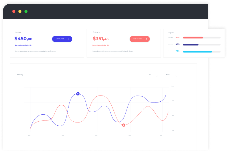
Interactive visualizations
Users can interact with the data visualizations by hovering over elements, clicking on them, or filtering the data to gain deeper insights.
Real-time data updates
Data visualizations can now be updated in real-time, allowing users to see the latest information as it becomes available.
Storytelling capabilities
Data visualizations can now tell a story by guiding users through a series of visualizations that build upon each other to convey a narrative.
Mobile-friendly designs
With the increasing use of mobile devices, data visualizations are now being optimized for smaller screens, ensuring a seamless user experience on smartphones and tablets.
Integration with AI and machine learning
Data visualizations can now leverage AI and machine learning algorithms to automatically identify patterns, trends, and anomalies in the data.
Augmented reality (AR) and virtual reality (VR) visualizations
AR and VR technologies are being used to create immersive data visualizations, allowing users to explore and interact with data in a virtual environment.
Customization options
Users can now customize data visualizations to suit their specific needs, such as choosing different color schemes, layouts, and chart types.
Start Your Data Visualization Services Process With Us
Why Choose Our Data Visualization Company Texas

You're looking for a data analytics company in Texas, and you want to make sure you choose the right one. Well, look no further than our company. Here's why:
- Expertise in Data Visualization: Lateral Matrix is a leading data visualization company in Texas, known for its expertise in transforming complex data into visually appealing and easy-to-understand graphics. With a team of skilled data analysts and designers, we have the knowledge and experience to create stunning visualizations that effectively communicate insights and drive decision-making.
- Customized Solutions: We understand that every business has unique data requirements. That's why we offer customized data visualization solutions tailored to meet your specific needs. Whether you need interactive dashboards, infographics, or animated visualizations, our team will work closely with you to understand your goals and deliver a solution that exceeds your expectations.
- Cutting-Edge Technology: At Lateral Matrix, we stay up-to-date with the latest advancements in data visualization technology. We utilize state-of-the-art tools and software to create dynamic and interactive visualizations that engage your audience. Our commitment to using cutting-edge technology ensures that your data is presented in the most impactful and innovative way possible.
- Proven Track Record: With a strong track record of successful projects and satisfied clients, Lateral Matrix has established itself as a trusted data visualization partner in Texas. Our team has worked with businesses across various industries, helping them unlock the power of their data through compelling visualizations. When you choose Lateral Matrix, you can be confident that you are partnering with a company that has a proven track record of delivering exceptional results.
1200+
Product Delivered
8+
Years Of Experience
200+
Experts
List of Industry Require Data Analytics Services

Retail and E-commerce

Healthcare

Finance and Banking

Manufacturing

Telecommunications

Energy and Utilities
Transportation and Logistics

Government and Public Sector

Media and Entertainment

Education and Research

Hospitality and Tourism

Agriculture and Farming

Real Estate and Construction

Insurance

Sports and Fitness
Our Data Visualization Service Process
- You start by reaching out to our team and expressing your interest in our data visualization service. We provide a seamless and user-friendly experience throughout the entire process.
- Once we understand your requirements and goals, we collaborate with you to gather the necessary data. This can include raw data files, spreadsheets, or even connecting directly to your existing databases.
- Our team of skilled data analysts and visualization experts then work diligently to clean, analyze, and transform your data into meaningful insights. We use cutting-edge tools and techniques to ensure accuracy and efficiency.
- Next, we design and create visually stunning and interactive data visualizations tailored specifically to your needs. Whether it's charts, graphs, maps, or dashboards, we ensure that the visualizations effectively communicate your data story.
- Finally, we deliver the finished data visualizations to you in a format of your choice. We provide ongoing support and assistance to help you effectively interpret and utilize the visualizations to make informed decisions and drive business growth.


Our Technology
- Tableau
- Power BI
- QlikView
- D3.js
- Google Data Studio
- SAS Visual Analytics
- IBM Cognos Analytics
- MicroStrategy
- Looker
- Plotly
Essential Performance Indicators for Data Visualization
- Number of successful data visualization projects completed
- Client satisfaction rating for data visualization services
- Percentage increase in client's data understanding and insights
- Number of new clients acquired
- Revenue generated from data visualization services
- Average project turnaround time for data visualization projects
- Number of data visualization tools and technologies utilized
- Number of data visualization training programs conducted
- Percentage increase in client's data-driven decision-making capabilities
- Number of industry awards and recognition received for data visualization projects

Testimonials

If you're looking for top-notch data visualization services in Texas, look no further than Lateral Matrix. They have a team of experts who can transform complex data into visually stunning and easy-to-understand graphics. With their help, we were able to gain valuable insights from our data and make informed business decisions. Highly recommended!
When it comes to data visualization services, Lateral Matrix is the go-to company in Texas. Their talented team knows how to present data in a way that is both visually appealing and informative. Thanks to their expertise, we were able to effectively communicate our data-driven findings to our stakeholders, leading to improved decision-making and business growth. Trust Lateral Matrix for all your data visualization needs!
Don't waste your time searching for data visualization services elsewhere in Texas. Lateral Matrix is the best choice hands down. Their skilled professionals have a deep understanding of data visualization techniques and tools, and they know how to create compelling visualizations that tell a story. Thanks to their services, we were able to present our data in a way that captivated our audience and helped us achieve our goals. Lateral Matrix is the partner you need for successful data visualization.
Case Study
You are a business owner in Texas looking to enhance your data analysis capabilities. With our data visualization services, we can help you transform complex data into visually appealing and easy-to-understand charts, graphs, and interactive dashboards. By presenting your data in a visually engaging manner, you can make informed decisions and identify trends and patterns that may have otherwise gone unnoticed.
As a marketing manager in Texas, you understand the importance of data-driven decision making. Our data visualization services can help you effectively communicate your marketing insights to stakeholders and clients. With our expertise in creating visually stunning infographics and interactive reports, you can showcase the success of your campaigns, identify areas for improvement, and drive impactful marketing strategies.